Trends are cyclical, and in 2025, one thing is clear—retro is back. Whether it’s grainy textures, muted tones, pixelated fonts, or VHS-style overlays, vintage aesthetics are having a major moment in both web and photo design. Far from being mere nostalgia, the retro revival reflects a deeper cultural longing for authenticity, imperfection, and warmth in an increasingly polished digital world.
But what exactly defines the retro look in today’s design landscape? And why are creatives everywhere diving into the past to shape the future?
The Allure of the Past in a Digital Present
Retro design taps into emotion and memory. It evokes familiarity—reminding us of old magazines, album covers, 90s video games, analog cameras, and early web aesthetics. In a time when modern design often leans toward minimalism and perfection, vintage visuals feel comforting and human.
This aesthetic is not just for show—it creates emotional resonance. A Polaroid-like photo or a retro website layout can instantly feel more personal, even if the viewer can’t quite put their finger on why.
Retro in Photo Design: Film Looks & Analog Vibes
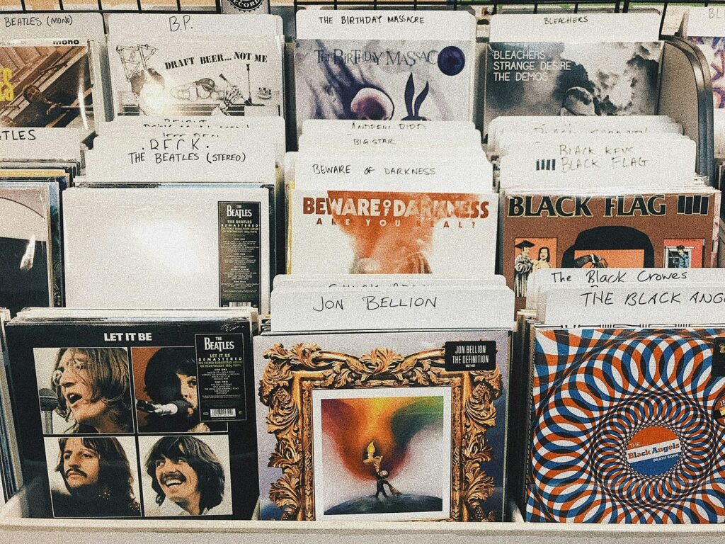
Vintage photography is more popular than ever, and the look goes beyond adding a simple sepia filter. Creators are recreating film stock grain, light leaks, lens flares, and color fading to mimic old cameras from the 70s, 80s, and 90s.
Popular retro photography trends include:
- Grain & Texture: Imitating 35mm or medium-format film
- Color Shifts: Muted, desaturated, or warm tones (Kodachrome vibes)
- Borders & Frames: Polaroid-style white borders or timestamp overlays
- Blur & Soft Focus: A slight imperfection to break the digital sharpness
- Flash Aesthetic: Direct flash mimicking disposable cameras
Tools like VSCO, Afterlight, and Lightroom presets make it easy to bring these nostalgic looks to life, while some photographers go full analog with actual film photography for a more authentic feel.
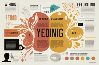
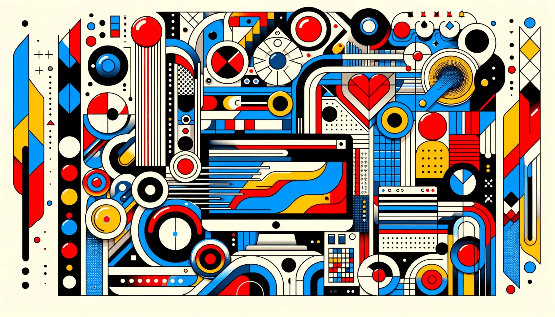
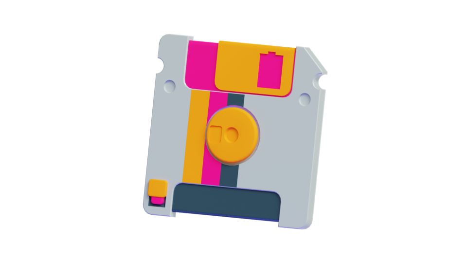
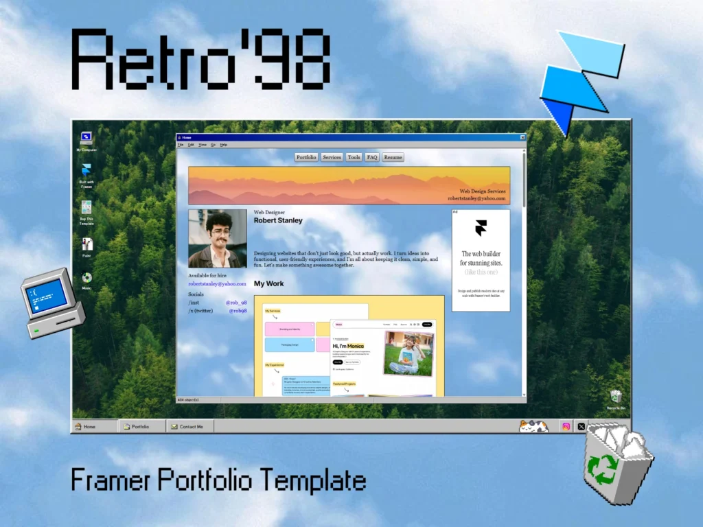
Retro in Web Design: Pixel, Pop, and Parallax
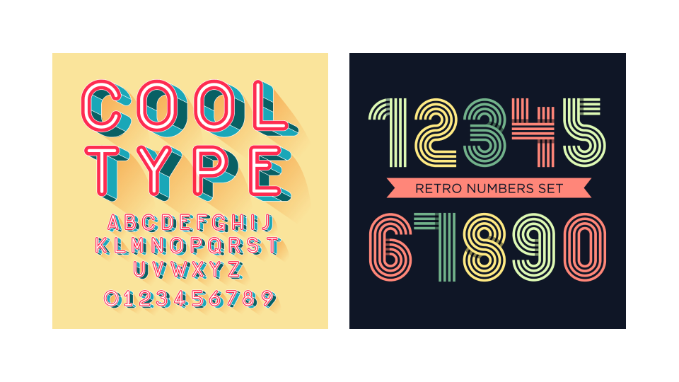
On the web, retro aesthetics are a bold counterpoint to the sleek, minimal UX of the last decade. Designers are drawing inspiration from early internet culture, vintage print, and classic software UI to create experiences that feel both playful and unexpected.
Key elements of retro web design include:
- Typography: Pixelated fonts, serif throwbacks, or script typefaces from the 60s–90s
- Color Palettes: Pastels, neon gradients, or warm earth tones reminiscent of older print media
- Textures: Paper grain, CRT screen distortion, and halftone patterns
- Layouts: Grid-heavy, asymmetrical, or collage-like arrangements
- Retro UI: Mimicking Windows 95, early HTML pages, or 8-bit interfaces
Many websites now include Easter eggs and interactive callbacks, such as scrolling marquees, clunky hover effects, or pixel-art illustrations that play into the retro tech fantasy.
Why Vintage Design Resonates Today
In a fast-paced digital culture dominated by automation and AI, retro design offers a sense of grounding. It reminds users of a time when things were slower, more tangible, and less polished. Vintage design brings texture and personality to digital experiences that can sometimes feel sterile.
It’s about more than just looking old—it’s about feeling real.
The imperfections of retro aesthetics—grain, clutter, uneven edges—are intentionally human, injecting a sense of craft into digital work.
Retro also signals trust and timelessness. Brands leveraging vintage styles often position themselves as having heritage, authenticity, or a connection to “the good old days,” even if they’re entirely new.
Where Retro Works Best
Not every brand or project is a fit for retro aesthetics—but when used intentionally, it can be a powerful tool. Here’s where vintage design shines:
- Creative Portfolios: Artists and designers showcasing their personality
- Fashion & Lifestyle Brands: Especially those inspired by thrift, DIY, or subcultures
- Music & Entertainment: Album drops, movie promos, or streaming playlists
- Food & Beverage: Especially craft brews, coffee, diners, or organic goods
- Social Media Campaigns: Where eye-catching nostalgia drives engagement
Balancing Retro with Modern UX
While vintage aesthetics are visually rich, they still need to function in today’s digital environment. Smart designers combine retro visuals with modern usability: responsive layouts, accessibility standards, and fast performance.
The goal is to capture the soul of the past without sacrificing the functionality users expect today.
Pro tip: Use retro design elements as accents, not crutches. A nostalgic color palette or vintage font can go a long way—there’s no need to recreate an entire 90s website unless that’s the goal.
Final Thoughts
Retro design isn’t just a passing fad—it’s a celebration of visual history. In both photography and web design, vintage aesthetics remind us that sometimes the best way forward is to look back.
Whether you’re layering grain onto your photos or building a neon-hued homepage that feels like an old arcade screen, retro gives your work character, warmth, and a story. And in a world of constant change, that kind of familiarity never goes out of style.