Color isn’t just decoration—it’s a fundamental part of how users perceive, understand, and interact with digital products. In modern UI design, color theory plays a critical role in crafting interfaces that are not only beautiful but also functional, accessible, and emotionally resonant. As screens become the primary medium through which we experience the world, the strategic use of color has become a cornerstone of effective digital design.
In 2025, color is doing more than ever before—guiding users, shaping moods, and enhancing usability. Here’s how color theory is shaping modern UI design today.
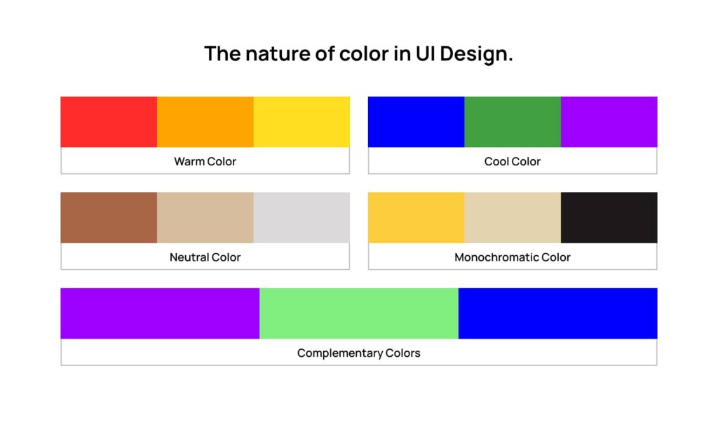
The Psychology Behind Color
Color triggers instinctive reactions. It can calm, excite, alert, or guide. When used correctly in UI, color does more than catch the eye—it communicates meaning and supports user behavior.
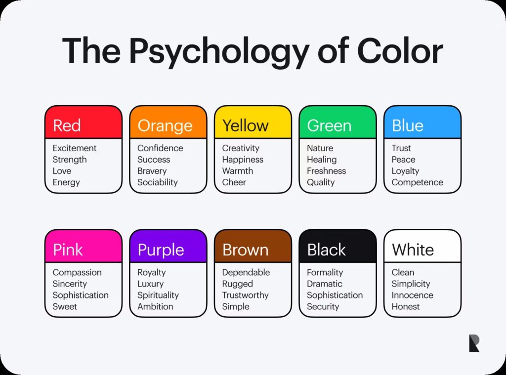
Here are some common emotional associations used in UI design:
- Blue → Trust, calm, security (popular in finance and healthcare apps)
- Green → Growth, balance, success (used in wellness, environment, fintech)
- Red → Alert, urgency, energy (often used for warnings or CTA buttons)
- Yellow → Optimism, warmth, attention (used sparingly to highlight or energize)
- Purple → Creativity, luxury, mystery (seen in artistic and high-end branding)
- Black/White → Clarity, contrast, elegance (foundational for minimalist designs)
Understanding these associations allows designers to reinforce a product’s tone and brand personality, creating cohesive emotional experiences.
Functional Color in UI: More Than Just Aesthetic
Color in modern UI isn’t just about visual appeal—it’s also a functional tool that helps users understand what to do and where to go.
1. Color as a Signifier
Color signals interaction. For example, clickable elements (like buttons or links) are often highlighted using brand-accent colors to indicate action.
Tip: Keep consistent color usage across the product to reduce cognitive load.
2. Hierarchy & Attention
A strong color hierarchy ensures users intuitively know which elements are most important. Bright or high-contrast colors draw attention to calls to action, while muted tones recede into the background.
Example:
Primary buttons are bold and saturated. Secondary buttons use neutral tones. Informational elements may use subtle accents.
3. Feedback & State Changes
Color is often used to show changes in system state: green for success, red for error, yellow for warnings, and gray for inactive elements. These visual cues help users navigate and understand feedback without needing to read.
Accessible Color Design
One of the most important aspects of modern UI color theory is accessibility. With an estimated 1 in 12 men and 1 in 200 women experiencing some form of color blindness, designers must ensure color is never the only way to convey information.
Best practices for accessible color use:
- Maintain a minimum contrast ratio of 4.5:1 for body text
- Use patterns, labels, or icons in addition to color for key statuses (e.g., red error + exclamation icon)
- Test with tools like Stark, Color Oracle, or built-in accessibility checkers in Figma and Adobe XD
Accessible color design ensures inclusivity—and also strengthens overall usability for everyone.
Color Trends in 2025 UI Design

While color theory is grounded in science and psychology, trends influence how it’s applied. In 2025, UI color palettes are reflecting broader cultural shifts and technological possibilities.
1. Neo-Muted Palettes
Soft pastels and dusty tones are replacing ultra-saturated colors. These palettes feel more natural, human, and calming—especially in wellness, lifestyle, and productivity apps.
2. Dark Mode Dominance
Dark interfaces continue to rise in popularity, valued for their modern aesthetic and battery-saving benefits. Designers are exploring deep hues, elevated contrasts, and glowing accent colors to enhance readability and ambiance.
3. Duotones and Gradients
Gradients are back in a big way, used subtly to add depth or boldly to create dynamic visuals. Duotones simplify images and UI elements, allowing for stronger branding and visual cohesion.
4. Emotive Brand Colors
Brands are moving away from traditional palettes to embrace colors that speak directly to their audience’s values. Think warm clay tones for eco-conscious apps or bright pinks and neons for bold Gen Z platforms.
Building a Smart Color System
To keep design scalable and consistent, modern UI teams build color systems into their design systems or component libraries. These typically include:
- Core palette: Brand and neutral base colors
- Functional colors: Success, warning, error, and information tones
- Extended palette: Accent and supporting colors for charts, tags, or personalization
- Tokenization: Using variables like
primary-500orbackground-darkto support theming and light/dark modes
This approach allows for adaptability across platforms and products, enabling teams to maintain consistency without limiting creativity.
Final Thoughts
Color theory is no longer just a foundation of design education—it’s a dynamic toolset that shapes the entire user experience. In modern UI, color enhances clarity, drives emotion, and reflects a brand’s voice—all while making interfaces more usable and inclusive.
When thoughtfully applied, color doesn’t just decorate a digital product—it defines how it feels, how it functions, and how it connects with users.
In the end, great UI design speaks through color long before a single word is read.