Typography is one of the most powerful tools in a designer’s toolkit. The right font pairing can elevate a design, create hierarchy, and convey tone—all without a single image. But combining fonts isn’t just about taste; it’s about structure, contrast, and consistency. Here’s a professional guide on how to choose fonts that work well together.
1. Understand Font Categories
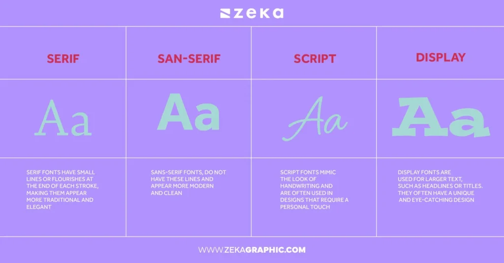
Before pairing fonts, you need to understand their classifications. Fonts are generally grouped into five categories:
- Serif – Classic and elegant; best for print or formal content (e.g., Times New Roman, Georgia)
- Sans-serif – Clean and modern; ideal for web and user interfaces (e.g., Helvetica, Open Sans)
- Slab Serif – Bold and impactful; good for headings (e.g., Rockwell, Museo Slab)
- Script – Decorative and expressive; best used sparingly (e.g., Pacifico, Great Vibes)
- Display – Highly stylized; great for logos or titles but not for body text
Tip: Pair fonts from different categories to create contrast while maintaining balance.
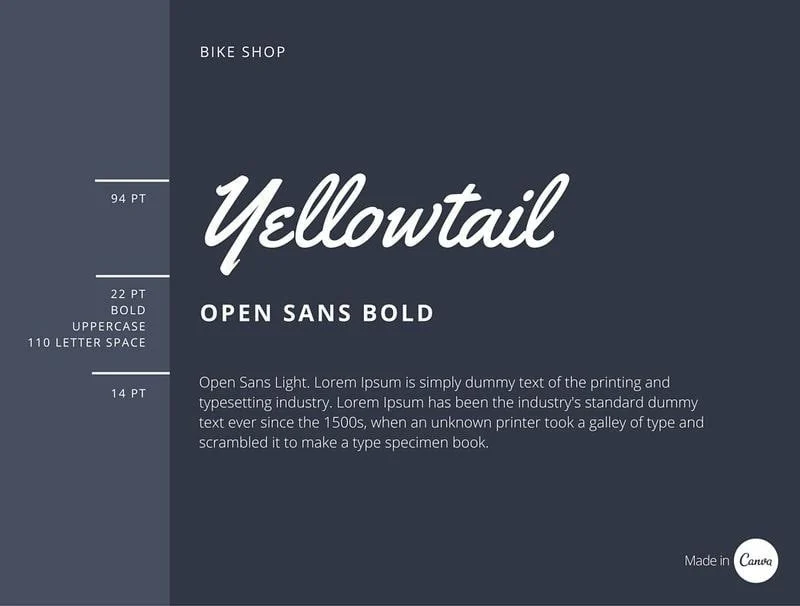
2. Create Clear Hierarchy
Every font pairing should serve a visual hierarchy. This means different fonts should signal different levels of importance, such as:
- Heading font: Bold, attention-grabbing, often display or slab serif
- Subheading font: Complementary, slightly smaller, often sans-serif
- Body font: Highly readable, usually simple serif or sans-serif
Good hierarchy = better readability and flow.
3. Use Contrast (But Not Clash)
The best font pairings strike a balance between contrast and harmony. Here’s how to achieve it:
- Mix styles: Pair a serif heading with a sans-serif body, or vice versa
- Vary weight and size: Combine a bold title with light body text
- Avoid too-similar fonts: Using two similar sans-serifs (e.g., Arial + Helvetica) feels like a mistake, not a decision
Example Pairings:
- Playfair Display (serif) + Source Sans Pro (sans-serif)
- Montserrat (display sans-serif) + Lora (serif)
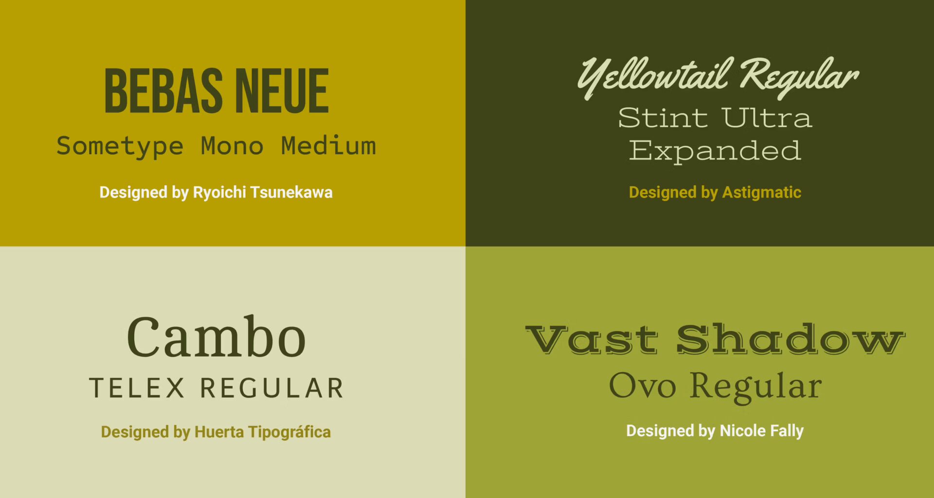
- Bebas Neue (all caps display) + Roboto (body text sans-serif)
4. Use Font Superfamilies
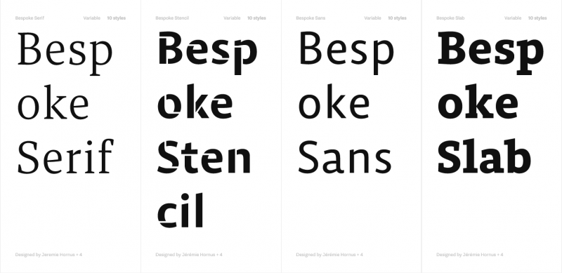
A superfamily includes multiple styles (serif, sans-serif, condensed, etc.) all designed to work together. This is the easiest and most foolproof way to combine fonts.
Popular Superfamilies:
- Roboto & Roboto Slab
- PT Serif & PT Sans
- Merriweather & Merriweather Sans
These offer built-in harmony with enough variation to establish contrast.
5. Match Font Moods and Intent
Fonts carry emotional weight. Before pairing, ask:
- Is the design formal or casual?
- Is the tone modern or vintage?
- Should the font feel bold or delicate?
For example:
- A legal firm might use Libre Baskerville + Open Sans
- A fashion brand might use Didot + Futura
- A playful blog could use Chewy + Raleway
Mood matching ensures visual coherence.
6. Pay Attention to X-Height and Proportions
Fonts with similar x-height (height of lowercase letters like “x”) and proportions tend to look more harmonious when combined.
- If x-heights are too different, the fonts can look awkward together.
- Check the spacing, letter width, and height of ascenders/descenders.
This level of detail is what separates amateur pairings from professional typography.
7. Limit Your Font Pairings
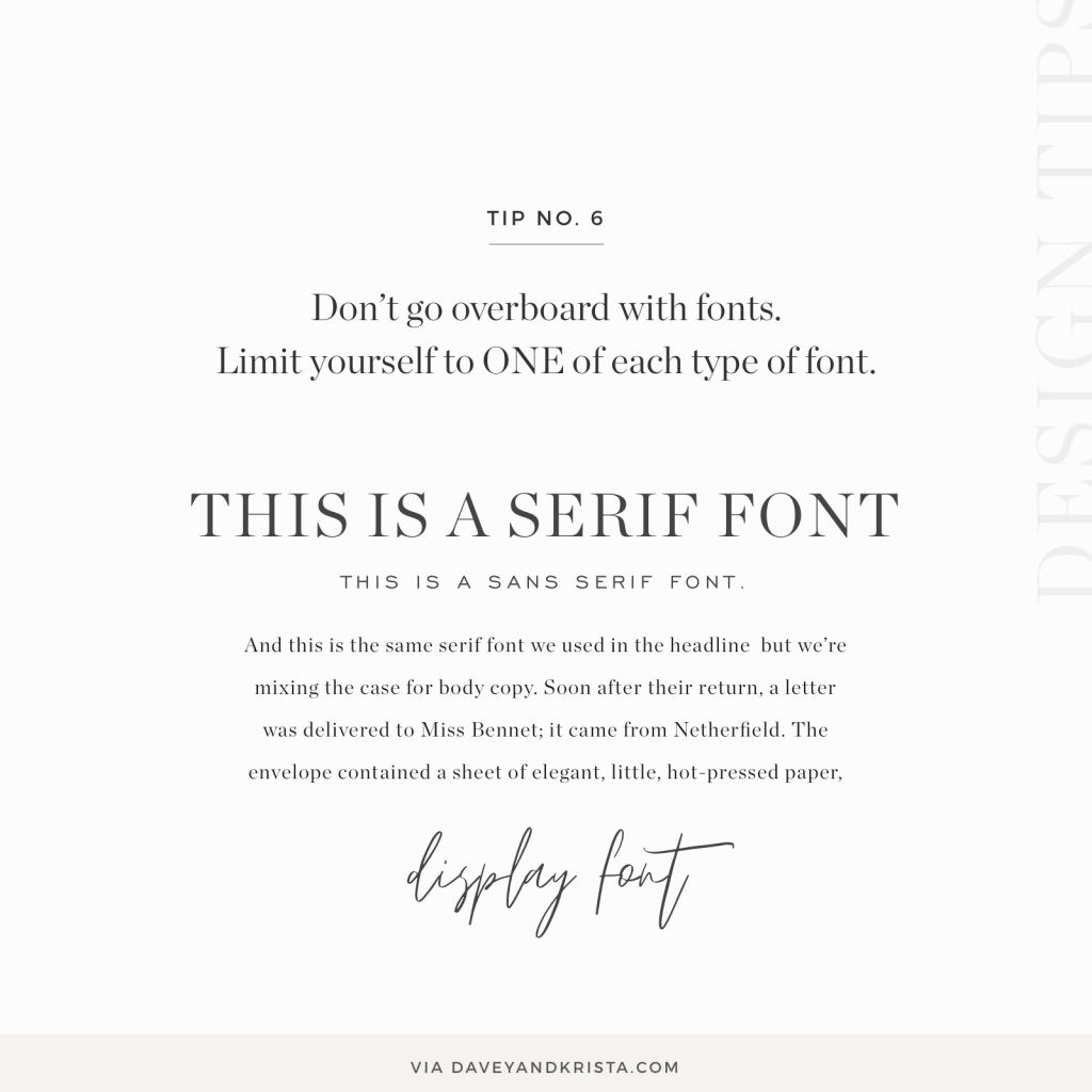
Stick to 2, max 3 fonts in any design project. Too many fonts clutter the design and confuse the reader.
A good rule of thumb:
- 1 font for headings
- 1 font for body copy
- Optionally, 1 accent font (e.g., script or display) for highlights or callouts
Less is more—keep it clean, consistent, and purposeful.
8. Use Pairing Tools and Resources
There are plenty of tools to help you find font combinations that work:
- Google Fonts – Offers suggested pairings for each font
- Fontjoy – Uses AI to generate font pairings with adjustable contrast
- Typ.io – Shows real-world examples of font pairings on the web
- Fonts In Use – See how professionals use type in real design projects
These resources can inspire and validate your choices.
Final Thoughts
Choosing fonts that work well together is a mix of science and style. Start with a strong understanding of type categories, use contrast to define hierarchy, and always aim for harmony in tone and proportion. Whether you’re designing a brand, a website, or an editorial layout, thoughtful font pairing will elevate your message and create lasting impact.
Typography isn’t just design—it’s communication. Choose wisely, and your fonts will speak louder than words.