A cohesive color palette is the backbone of a memorable and effective web design. The right colors don’t just make your site look good—they set the tone, guide users, and influence behavior. Whether you’re building a brand-new site or refreshing an old one, this guide will walk you through how to create a professional, balanced color palette that works across devices, components, and user interactions.
1. Understand Color Psychology and Brand Goals
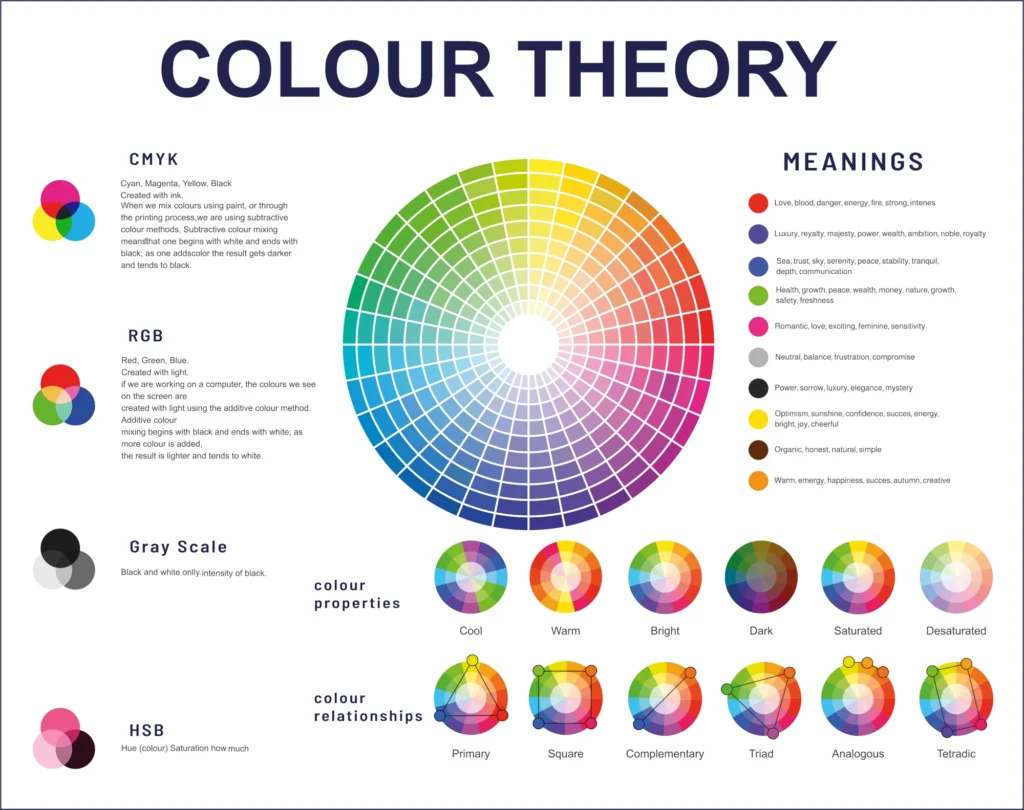
Before picking any colors, clarify the emotion and message you want your website to convey. Different colors trigger different psychological responses:
- Blue: Trust, professionalism, calm (used by banks, tech companies)
- Red: Urgency, passion, excitement (used in sales, food brands)
- Green: Growth, nature, health (used by eco-friendly or wellness brands)
- Yellow: Optimism, energy, attention (used to highlight or prompt)
- Black/Grey: Sophistication, neutrality, stability
Ask yourself:
- Who is the audience?
- What mood should the design evoke?
- What is the brand’s voice—playful, elegant, minimal, bold?
Your palette should reinforce these answers visually.
2. Choose a Base Color (Brand Primary)
Start with your primary color—this is the anchor of your palette. It’s often the brand color or the one used in the logo.
How to choose a strong base:
- Look for a versatile hue that works well in both light and dark contexts
- Make sure it contrasts well with white or black text
- Avoid oversaturated or overly trendy shades unless it matches the brand
This color will drive the look of headers, buttons, links, and key visuals.
3. Build a Supporting Color System
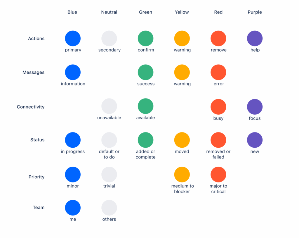
A solid palette typically includes:
- 1 Primary color – Your main brand color
- 1–2 Secondary colors – Used for highlights, accents, or variation
- Neutral colors – For backgrounds, text, and structure (white, black, grey, beige)
- 1 Accent color – For call-to-actions or important UI elements
- Feedback colors – For success, warning, and error messages (commonly green, yellow, red)
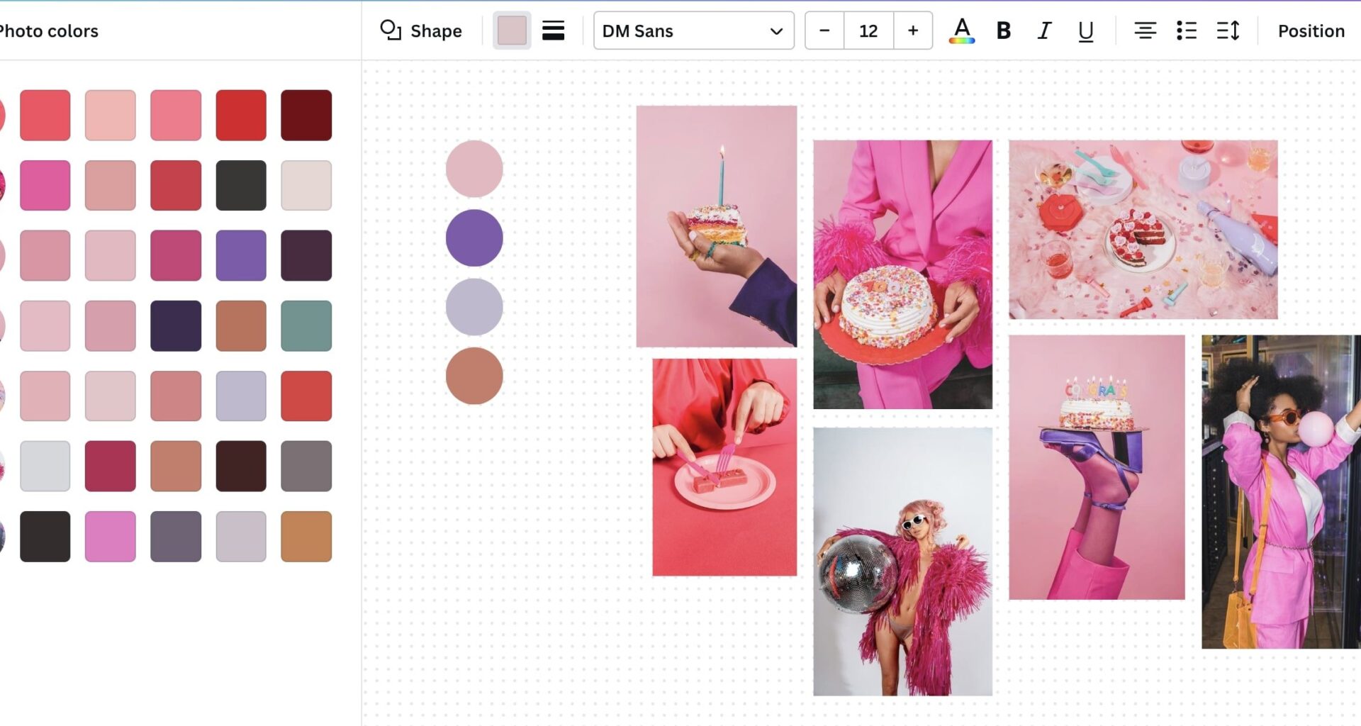
Tip: Use a tool like Coolors, Adobe Color, or Color Hunt to generate harmonious combinations using color theory principles (analogous, complementary, triadic, etc.).
4. Consider Color Contrast and Accessibility
Accessibility isn’t optional. A good palette must provide enough contrast for users with visual impairments, especially between text and background.
Follow WCAG guidelines:
- Text should have a contrast ratio of at least 4.5:1 against its background
- Use tools like Contrast Checker or Stark (Figma/Sketch plugin) to validate combinations
- Avoid color-only indicators (e.g., don’t use red text alone to show errors—add icons or underlines)
Accessible design = better UX for everyone.
5. Create Light and Dark Variations
Modern websites need to be flexible. Consider how your colors will perform in light and dark modes.
- Tints (adding white) and shades (adding black) of your primary/secondary colors provide depth and flexibility
- Design for hover states, active buttons, disabled states using variations of your palette
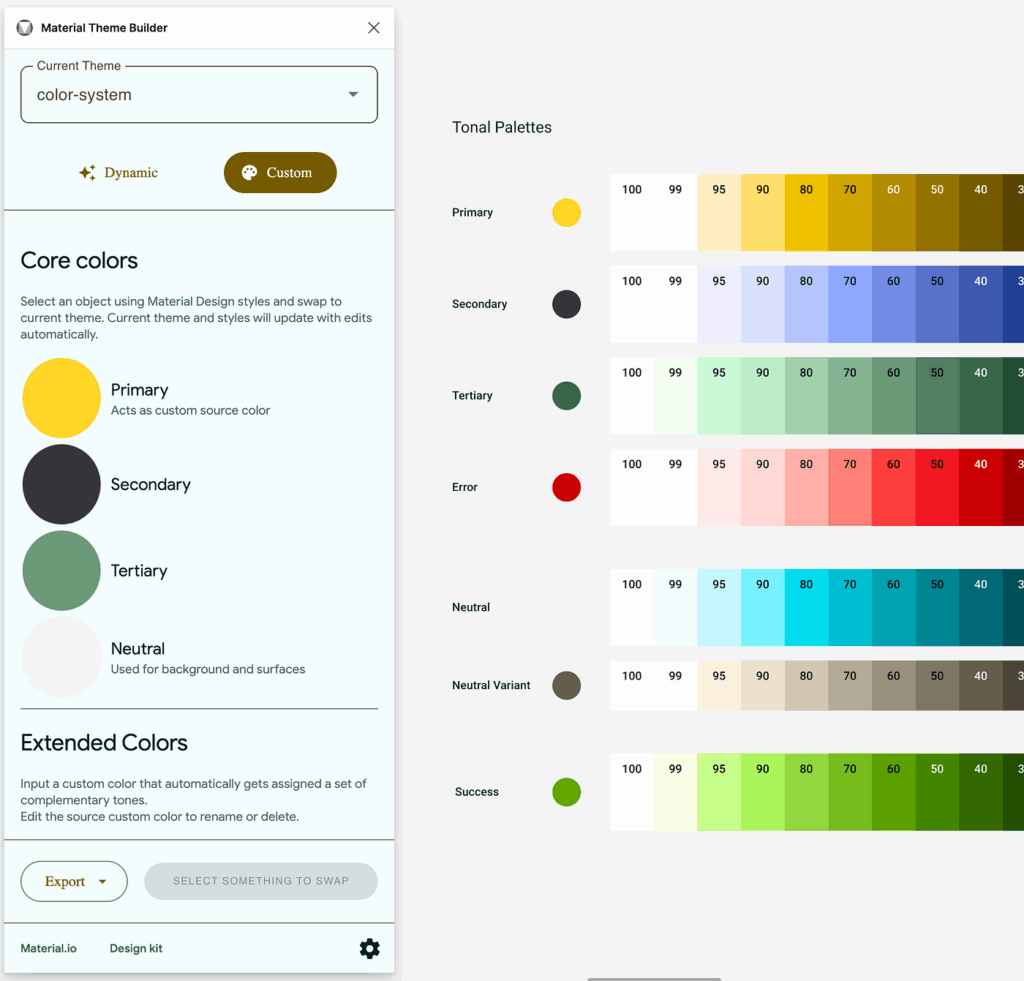
- Build a color scale for each major color (e.g., Blue 100, Blue 200, Blue 300…)
This creates consistency and allows easy application across UI components.
6. Use Neutrals to Balance the Palette
Neutral colors—like white, black, greys, and muted tones—are essential for structure and spacing.
How to use them well:
- Light grey for subtle borders or dividers
- Dark grey for text to reduce harshness compared to pure black
- Off-white or cream backgrounds to reduce eye strain
Neutrals prevent your site from feeling cluttered and allow accent colors to pop.
7. Test Your Palette in Context
Once you have your palette, apply it to real UI components:
- Buttons, links, headers, cards, backgrounds, and form fields
- Simulate hover and active states
- Try it on both desktop and mobile screen mockups
You may love a color in isolation, but it might clash or lose visibility when placed next to others. Prototyping tools like Figma, Sketch, or Adobe XD let you test quickly.
8. Document and Systematize Your Colors
Professional web projects benefit from a color system, not just a palette. Create documentation for:
- Color names (e.g., Primary 500, Neutral 100)
- Hex or RGBA values
- Usage rules and examples (e.g., Primary 600 for buttons, Accent for alerts)
Use tools like Design Tokens, Style Dictionary, or Tailwind CSS color scales to implement your palette consistently across code and design.
Final Thoughts
A cohesive color palette is more than just visually appealing—it brings unity to your brand, supports usability, and enhances user experience. By starting with purpose, applying color theory, testing for accessibility, and documenting your decisions, you can design a palette that feels intentional and professional.
Remember: color is communication. Make every hue count.