Grids and layouts are the invisible scaffolding of great design. Whether you’re crafting a website, mobile app, poster, or presentation, mastering these fundamentals will help you create visually balanced, user-friendly, and aesthetically powerful work. In this guide, we’ll break down how to use grids and layouts like a pro—so your designs not only look good, but feel right.
1. Understand the Purpose of Grids
At their core, grids are frameworks that guide the placement of visual elements. They bring order, rhythm, and consistency to a design. Professionals use grids to:
- Create visual alignment and harmony
- Improve readability and user experience
- Speed up decision-making during layout
- Maintain consistency across multiple pages or screens
Think of a grid as a silent partner—never visible to the user, but crucial for strong composition.
2. Master the Types of Grids
There’s no one-size-fits-all grid. Understanding the major types can help you choose the right one for your project:
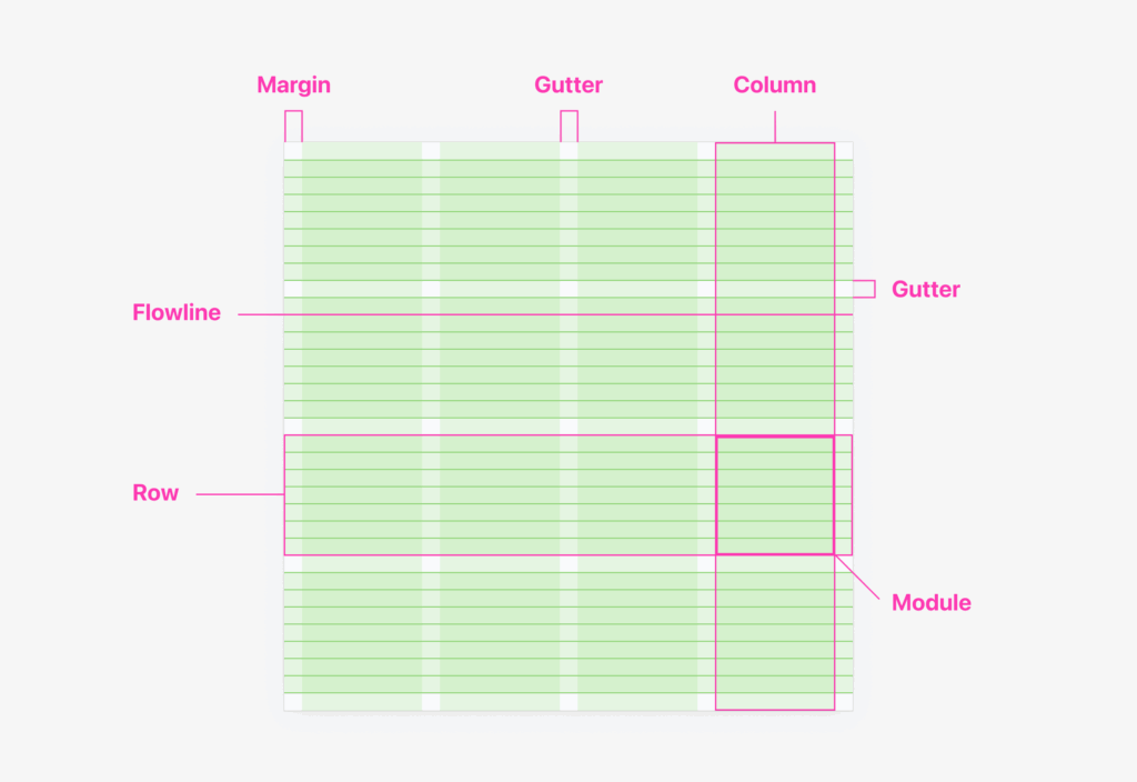
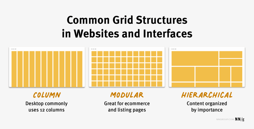
Column Grid
Most commonly used in web and editorial design. Typically 2 to 12 columns.
- Allows flexible layouts with images, text, and buttons
- Supports responsive design with breakpoints for different screens
Modular Grid
Expands on column grids by adding rows, creating a matrix of cells.
- Useful for dashboards, portfolios, or product listings
- Ensures spatial balance both vertically and horizontally
Baseline Grid
Aligns text across rows to a consistent vertical rhythm.
- Crucial in typography-heavy layouts like blogs and magazines
- Helps with text hierarchy and legibility
Hierarchical Grid
A loose, content-driven grid based on the visual weight of elements.
- Great for creative layouts, posters, and asymmetrical designs
3. Use the Rule of Thirds and Golden Ratio
Designers often draw from classic visual principles:
- Rule of Thirds: Divide your canvas into 3×3 sections and place key elements at the intersections. This creates natural focal points.
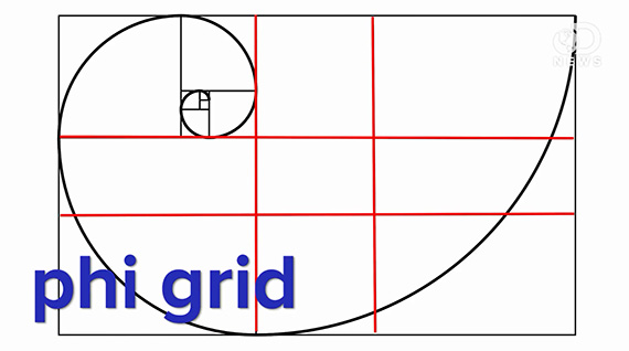
- Golden Ratio (1:1.618): Use this proportion to guide the relationship between elements (like image size vs. whitespace). It’s visually satisfying and time-tested.
These aren’t strict grids, but conceptual layout tools that create natural flow.
4. Align Elements Precisely
Consistency is key in professional design. Align text, images, and shapes along shared axes to create a cohesive visual rhythm. Most design software (Figma, Adobe XD, Sketch) has built-in snap-to-grid and alignment guides—use them religiously.
Tips:
- Align images with text baselines, not just their bounding boxes
- Use padding and margins consistently
- Match spacing between grouped elements (modular spacing like 8px, 12px, 16px)
5. Embrace Whitespace
Whitespace (also called negative space) is just as important as the content itself. It helps:
- Emphasize key elements
- Reduce visual clutter
- Guide the user’s eye through the design
Don’t be afraid of “empty” areas—professionals use whitespace to create elegance and clarity.
6. Apply Responsive Grids for Digital Design
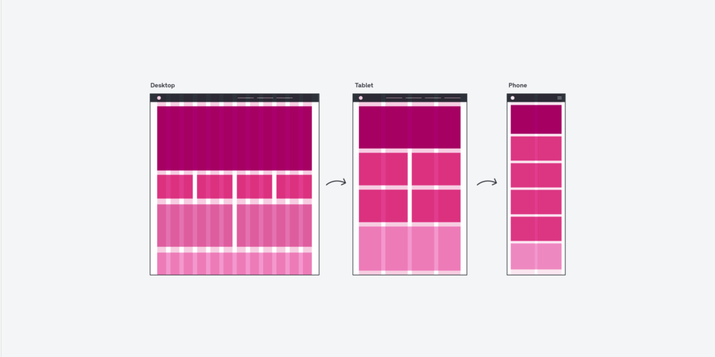
For websites and apps, your grid needs to adapt across different screen sizes. Responsive grids rely on breakpoints and flexible column systems.
- 12-column grids are common for web design—easy to divide into halves, thirds, quarters, etc.
- Use percentage-based widths instead of fixed pixels for flexibility
- Plan how content will reflow on mobile (stacking vs. scaling)
Frameworks like Bootstrap or design systems like Material Design follow these principles closely.
7. Practice Hierarchy Through Layout
Grids help organize content, but layout dictates what people notice first. Use visual hierarchy techniques like:
- Size and scale
- Color and contrast
- Placement within the grid (top-left = high attention, bottom-right = low)
Arrange elements to guide the user’s eye in a natural pattern (Z-pattern or F-pattern are common for web pages).
8. Break the Grid—Intentionally
Once you understand how to use grids, you can break the rules to create visual interest. Designers often offset elements or use overlapping layers to:
- Draw attention
- Add energy and contrast
- Break monotony in symmetrical designs
The key is doing it strategically—a well-timed disruption only works if it contrasts with order.
9. Use Tools That Support Grids Well
Top design tools offer built-in grid systems:
- Figma: Layout grids (columns, rows, grids) + snap-to options
- Adobe XD: Responsive resize, padding, and layout grids
- Sketch: Smart guides, symbols, and grid overlays
You can also use plugins like Gridifier, Layout Grid, or GuideGuide to automate grid creation.
Final Thoughts
Grids and layouts are more than just technical tools—they’re part of the language of visual design. Mastering them allows you to build interfaces, pages, and visuals that feel cohesive, polished, and purposeful. Whether you’re designing for print, web, or mobile, the principles remain the same: plan with precision, balance with whitespace, and guide with hierarchy.
Great designers don’t just use grids—they make them work invisibly to amplify the message.