Typography has always been more than just letters on a page—it’s a vital part of visual communication that influences how we read, feel, and interact with content. In 2025, typography is evolving faster than ever, driven by the rise of expressive branding, new technologies, and a renewed appreciation for storytelling through type.
From kinetic type to ultra-legible variable fonts, designers are using typography to make bold statements and create immersive digital experiences. Here’s a look at the top typography trends that are shaping the design landscape this year.
1. Kinetic Typography (Animated Type)
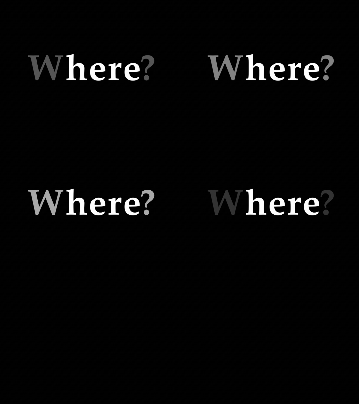
Static type is taking a back seat as motion becomes an integral part of modern design. Kinetic typography—where type moves, warps, expands, or responds to user input—is dominating everything from websites to social media and UI animations.
Why it’s trending:
It captures attention, adds emotional tone, and enhances storytelling. Moving text is no longer just a visual trick—it’s a dynamic way to guide, entertain, or even instruct users.
Where to use it:
- Hero sections on websites
- Video intros or titles
- Scroll-based animations in interactive stories
2. Variable Fonts and Responsive Typography
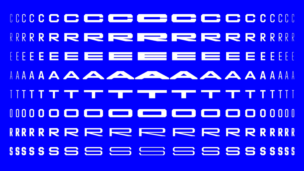
With a growing emphasis on accessibility and device flexibility, variable fonts have become a must-have. These dynamic fonts adjust weight, width, and slant in real time, providing full typographic control with just one file.
Benefits:
- Improved performance (fewer font files)
- Smoother responsiveness across screen sizes
- Greater design flexibility without sacrificing consistency
Variable fonts also allow micro-adjustments that improve legibility and accessibility, especially for users with visual impairments.
3. High-Contrast Serif Fonts
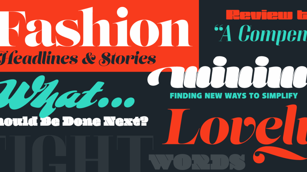
Serifs are officially cool again, especially the high-contrast variety—think sharp transitions between thick and thin strokes. These fonts bring a modern elegance and editorial flair to digital spaces that once favored only sans-serif.
Why it works:
They stand out on minimalist layouts, evoke heritage and sophistication, and pair beautifully with photography or muted color palettes.
Popular styles:
- Didones (e.g., Bodoni-inspired typefaces)
- Modern serifs with exaggerated curves or pointed terminals
4. Brutalist and Anti-Design Typography
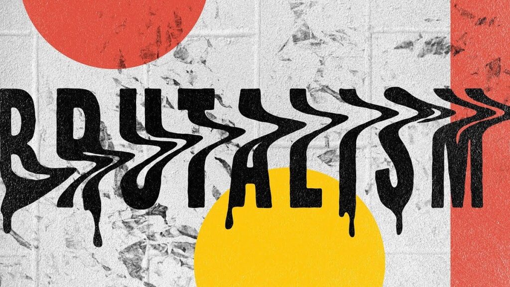
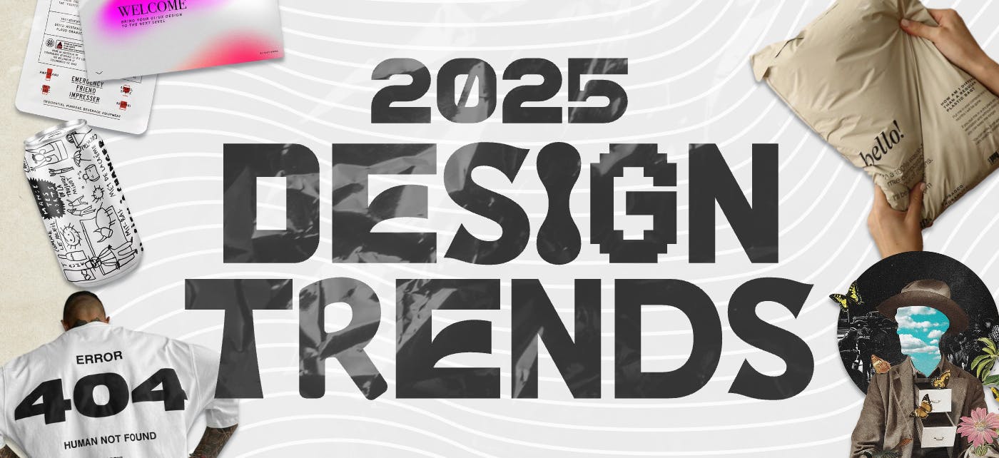
Pushing back against the polish of corporate minimalism, designers in 2025 are embracing raw, loud, and unconventional typography. This includes clashing fonts, oversized letters, uneven spacing, and intentionally “ugly” layouts that challenge traditional design rules.
Use with care:
This trend is ideal for brands with strong personalities—especially in fashion, art, and music—but can alienate users if overdone or applied without purpose.
5. Oversized and Maximalist Type
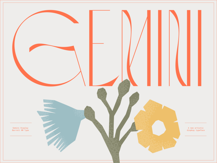
Big, bold type is still in—and it’s getting even bigger. Whether it’s used in headlines, navigational elements, or as a graphic feature, oversized typography commands attention and creates visual hierarchy without relying on images.
Design tip:
Let large type become part of the layout architecture. Use it to divide sections, lead the eye, or replace traditional hero imagery.
6. Custom & Handcrafted Lettering
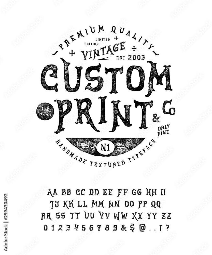
In an era of AI-generated everything, handmade and custom type is making a meaningful comeback. From hand-lettered scripts to bespoke typefaces designed specifically for a brand, this trend emphasizes authenticity and character.
Where it shines:
- Logos and packaging
- Brand storytelling
- Creative portfolios or editorial sites
Designers are combining traditional drawing techniques with digital tools to craft unique lettering styles that stand out in a sea of templates.
7. Monospaced and Retro Typefaces
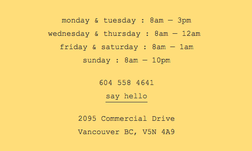
Retro is still in full swing, and typefaces are no exception. Monospaced fonts (originally designed for typewriters and code) are being reimagined for modern web and UI use. Pair them with glitchy visuals, grid layouts, or minimalist interfaces to get a nostalgic-yet-fresh vibe.
Popular influences:
- 80s arcade and synthwave aesthetics
- 90s web fonts and bitmap styles
- Early terminal or system fonts, elevated with modern spacing and animation
8. Typographic Layering and Texture
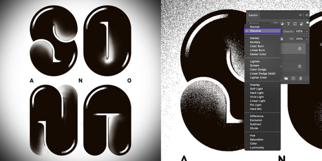
Designers are adding depth and complexity to type through layering—placing text behind or within images, using gradients or cut-outs, and combining type with texture or noise overlays.
Why it works:
It adds visual interest without cluttering the design, turning text into an artistic element that complements the message.
Tip:
Balance is key. Over-layering can quickly reduce legibility. Use hierarchy and contrast to maintain clarity.
9. Multilingual and Inclusive Typography
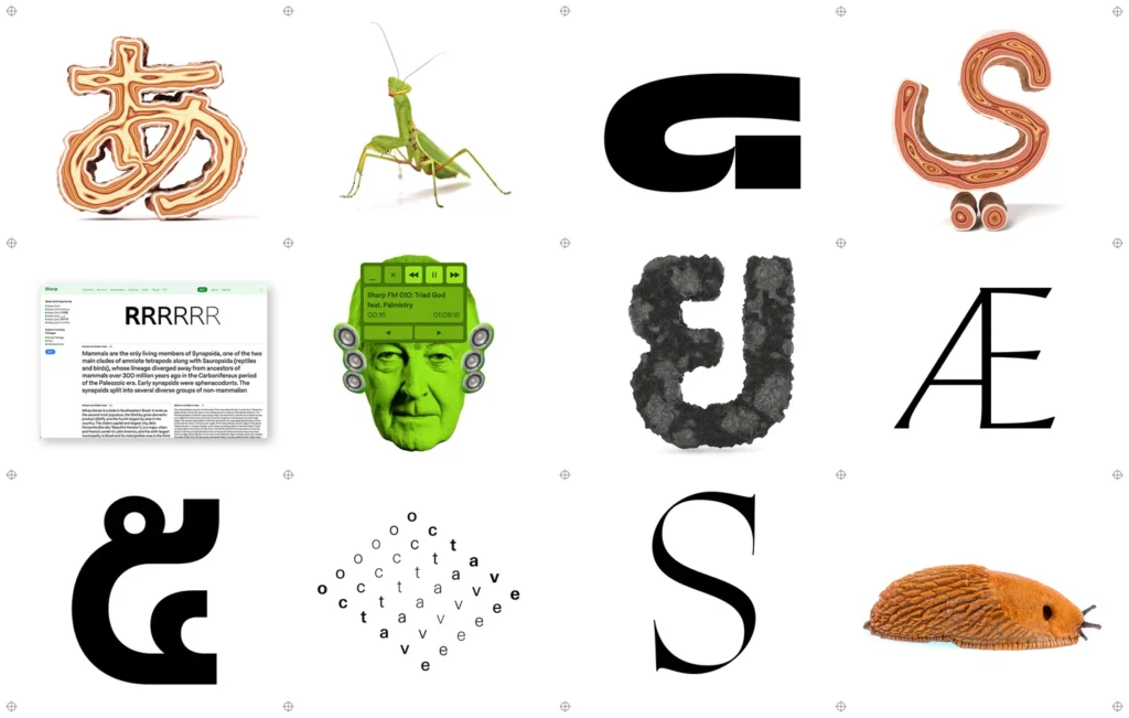
With global audiences and diverse users in mind, 2025 is seeing a rise in multilingual typography and type systems that support a wide range of scripts—Arabic, Cyrillic, Devanagari, Han characters, and more.
Designers are prioritizing:
- Consistent tone across languages
- Accessible line spacing and character sizing
- Cross-cultural font pairings that respect regional aesthetics
This shift reflects a broader move toward inclusive, global-first design.
Final Thoughts
Typography in 2025 is bold, flexible, and full of personality. Whether it’s in motion, stacked to the max, or crafted by hand, type is doing more than delivering information—it’s expressing identity, mood, and emotion.
The key to staying current isn’t chasing every trend—it’s knowing when and how to use them to enhance your message and support your users. After all, great typography doesn’t just look good—it speaks volumes, even before the first word is read.


