You’re putting the final touches on a brand identity. The logo feels confident, the color palette is balanced, and the layout sits exactly where it should. Yet something still feels slightly out of tune.
You tweak the spacing. Adjust the font weight. Shift elements around the page. Nothing seems to solve the problem. Then the realization arrives: the typography is working against itself. Both typefaces are strong on their own, but together they create subtle visual tension that quietly weakens the entire design.
This is why font pairing remains one of the most critical—and most misunderstood—aspects of typography. The way typefaces interact can elevate a design system or undermine it entirely. Even experienced designers can fall into familiar traps.
To better understand these pitfalls, we gathered insights from leading designers and typographers who shared the mistakes they encounter most often—and the strategies they use to avoid them.
01. Choosing fonts that are too similar
One of the most frequent mistakes is pairing typefaces that look almost identical but differ just enough to create visual discomfort.
Imagine combining two geometric sans-serifs with nearly the same personality, differing only in subtle details such as x-height, stroke endings, or proportions. Rather than feeling intentional, the pairing often appears accidental.
As Charlie Beeson, Design Director at FutureBrand, explains, viewers tend to become distracted by those small inconsistencies. Tiny differences in proportions or terminals can create a nagging visual imbalance that’s difficult to ignore.
Alice Munday, Design Director at Curious, agrees. When two fonts perform essentially the same role, their coexistence can feel unjustified.
The solution is purposeful contrast. When combining typefaces, the relationship between them should be immediately apparent. A strong typographic hierarchy signals intent; a weak one often feels like a mistake.
02. Failing to assign clear roles
Even an excellent font combination can fall apart if each typeface lacks a defined purpose within the system.
When designers don’t establish where and how each font should be used, inconsistency inevitably creeps into the work. Over time, typefaces begin appearing interchangeably across different applications, gradually eroding the coherence of the brand.
Visual identity designer Natasha Lucas emphasizes that undefined roles often lead to fragmented communication and a diluted brand voice.
Mat Desjardins, Founder and Creative Director of Pangram Pangram, believes functionality should always outweigh superficial visual similarities.
Rather than pairing fonts because they share interesting details or stylistic quirks, designers should focus on how they behave within a layout. Proportions, rhythm, spacing, texture, and intended purpose are far more important than decorative traits.
Alice Munday adds that successful pairings create mutual enhancement. Each typeface should contribute something distinct while making the other perform even better.
The goal isn’t difference for its own sake—it’s meaningful contrast with a purpose.
03. Combining two fonts that both demand attention
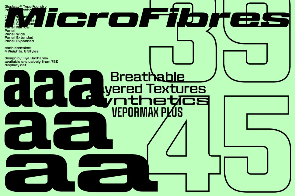
Another common mistake is pairing two highly expressive display typefaces and expecting them to coexist peacefully.
The result is often similar to placing two lead vocalists on the same stage at the same time. Instead of harmony, you get competition.
Charlie Beeson describes the issue succinctly: when every element tries to become the hero, nothing stands out.
Mat Desjardins sees the same problem frequently. Designers are naturally drawn to expressive typefaces, and once they discover one striking font, it’s tempting to pair it with another equally bold choice.
In practice, however, two dominant voices rarely create hierarchy. More often, they generate visual noise.
A successful system allows one typeface to take center stage while the other provides structure and support. Character and clarity need to work together, not compete for attention.
As Mat puts it, one font should speak while the other understands when to step back.
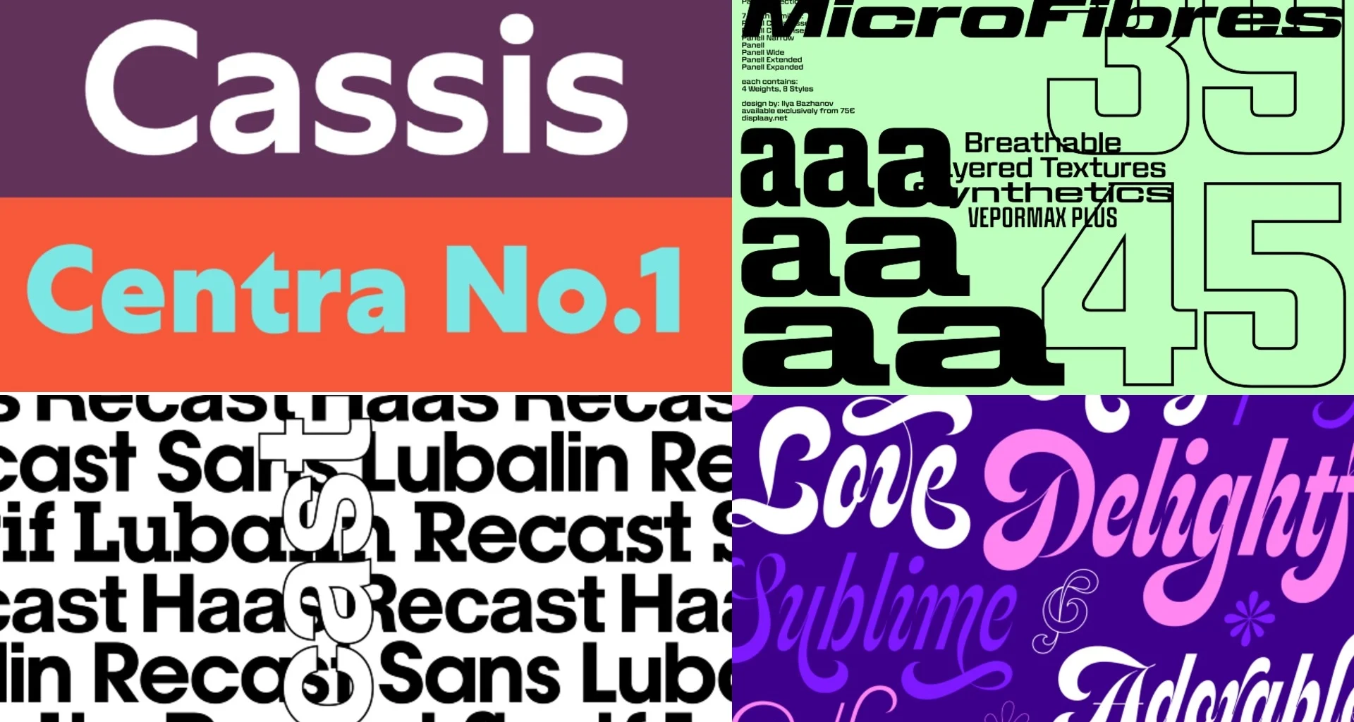
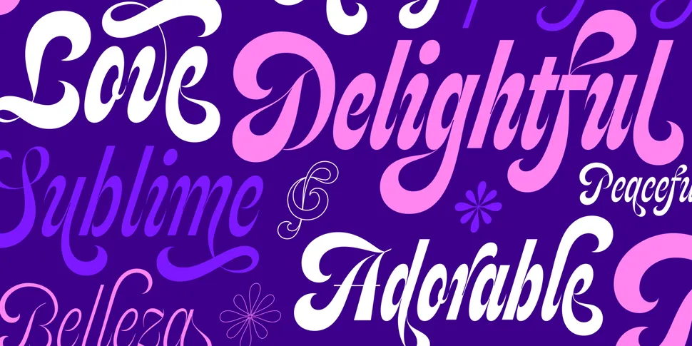
04. Pairing two serif fonts without careful consideration
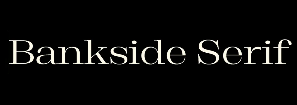
Using two serif typefaces isn’t inherently wrong, but it requires a deeper understanding of typographic nuance.
Creative Director Riccardo De Franceschi compares the challenge to wearing a jacket and trousers in nearly—but not quite—the same color. The effect can be sophisticated, but only when executed with precision and confidence.
The greatest danger appears when two serif fonts feel related in heritage yet express themselves differently. Readers may struggle to understand the visual relationship, creating confusion rather than cohesion.
To minimize risk, Riccardo recommends considering a superfamily—a collection of serif and sans-serif typefaces specifically designed to work together.
These systems provide built-in harmony while still offering enough contrast to establish hierarchy and visual interest.
Examples such as Aldgate and Bankside demonstrate how carefully coordinated families can deliver distinction without sacrificing consistency.
05. Ignoring hierarchy
Even designers who commit to a single type family can make a critical mistake: treating every weight, size, and style as if they serve the same purpose.
The result is often a design that feels flat, repetitive, and lacking in visual energy.
Jenny Truong, Associate Creative Director and Lead Designer at Park & Battery, notes that relying on the same style throughout headings, subheadings, and body text removes opportunities for contrast and emphasis.
Most modern type families include a wide range of weights and styles for a reason. Those variations help establish structure, guide readers through content, and inject personality into layouts.
Jenny recommends limiting designs to two or three clearly differentiated type treatments. Beyond font weight, factors such as sizing, capitalization, and letter spacing can dramatically influence visual hierarchy.
When used thoughtfully, even a single typeface family can create a rich and dynamic reading experience.
06. Assuming every project needs multiple fonts
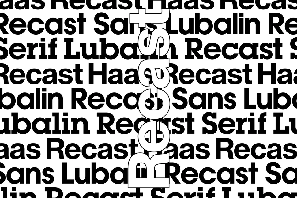
Perhaps the most overlooked mistake is believing that typography always requires multiple typefaces.
According to Natasha Lucas, many brands can achieve a distinctive and highly functional identity using just one well-chosen font family.
Adding additional typefaces without a clear strategic reason often introduces unnecessary complexity and weakens brand recognition rather than strengthening it.
Typographer Eleni points out that many contemporary typefaces include optical size variations, allowing them to adapt gracefully across different scales and applications without the need for a secondary font.
She cites Haas Recast as an example. The typeface includes a tracking axis that enables tighter spacing for headlines and more open spacing for body text, allowing a single family to perform multiple roles while maintaining a cohesive visual language.
In many cases, typography can solve its own hierarchy challenges without introducing a second voice.
Key takeaway
Whether you’re combining two typefaces or building an entire system around one, the same principle applies: every typographic choice should be intentional.
Strong typography isn’t defined by the number of fonts in use but by the clarity of their purpose. Every typeface should have a specific role, contribute to the overall hierarchy, and support the message being communicated.
As Natasha Lucas summarizes, effective typography systems are built on purpose, not quantity.
If you can’t clearly explain why a font is there and what function it serves, there’s a good chance it doesn’t belong in the design at all.